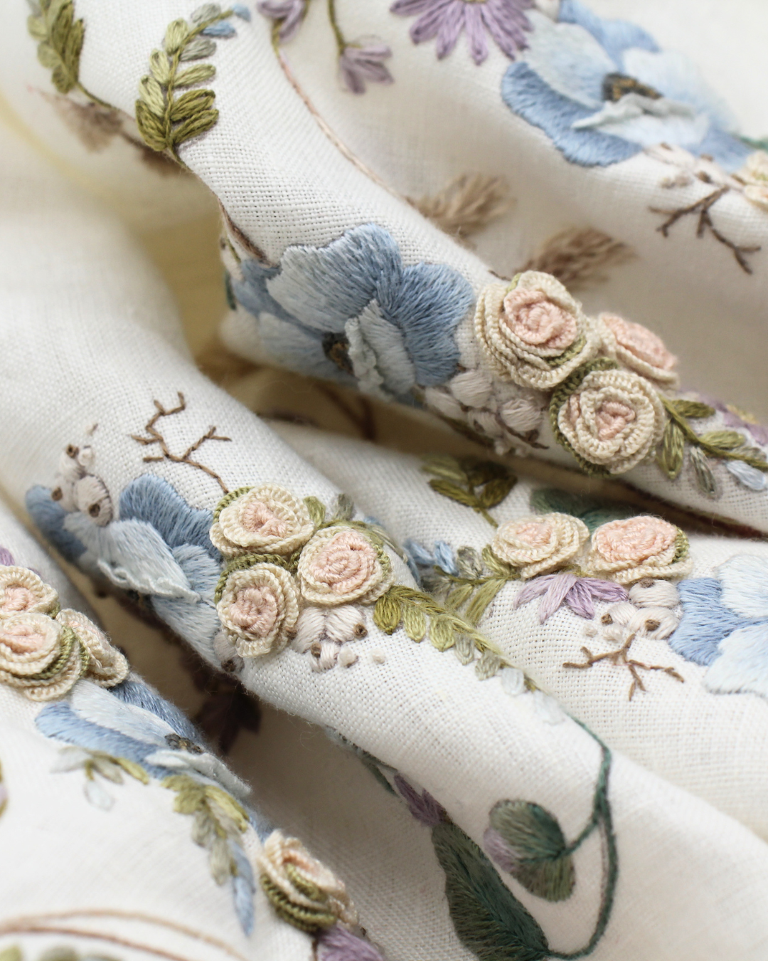
I don’t really know why I kept the work in progress of the padded stitch yard only to myself, without ever showing or telling. I am incapable of keeping secrets, yet I brooded in silence.
And now I find myself unphased: trying to recapitulate something that has slipped my mind, while doing something else. And so I can’t recount what I’m doing now and I can’t remember what I did then.
And I feel absolutely compelled to do so, because you can’t just blurt out a cover, without romanticising the epic feat!
Can one?
Then perhaps the urge to narrate is all and only mine: putting words in order, emptying shelves of dust-filled synapses, will make room for the new that is to come and finds no space. The idea of a new beginning, as with every new end, paralyses me.
Finally, if I can finally manage to let this problematic creature take on a life of its own by detaching itself from me, perhaps a new energy will be able to spread among these sluggish and withered neurons, which cannot even remind me of the day’s appointments.
So I try to remember.
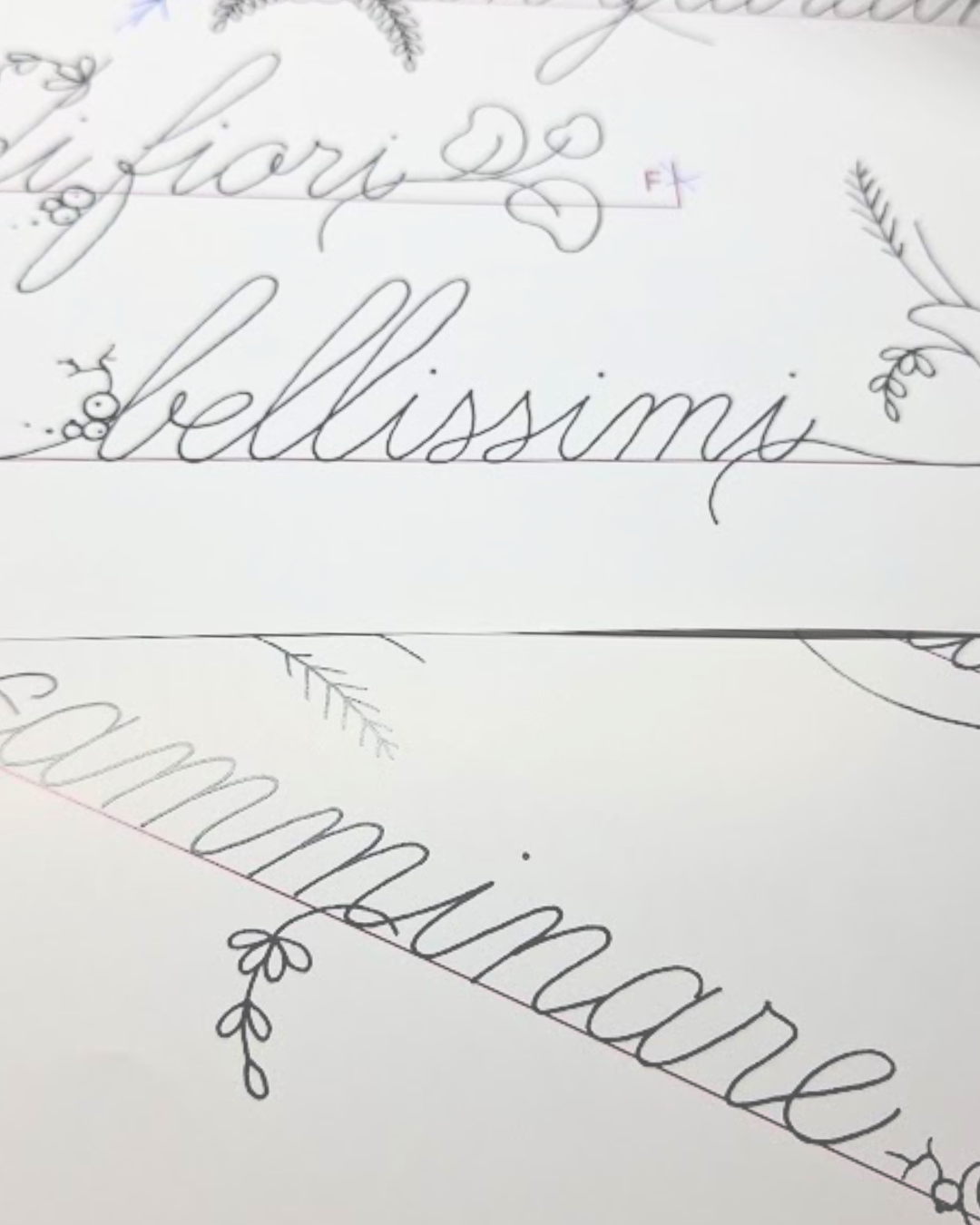
The first images that resurface have red graph paper as a background, on which I draw red blue lines. Before the book was born the title: The ABC of padded stitch. ABC to evoke my maniacal obsession with alphabets and the purpose of the manual, which was to investigate the fine movements that the padded stitch requires to shine, starting from the basics, as one would do in school to learn how to write.
From the idea of the school was also born the idea of the colours red and blue, which are the colours of the mythical pencil that dictated our fate.
And then, when I started embroidery back in 1988… The needle that drew my first initials was pulling red and blue threads!


I remember trying to find the style with which to draw (in a civilised way) alphabets and I also remember wanting to draw alphabets of my own. I was fixated on the idea that I would draw letters that were all perfectly inscribed in a geometric shape, so that they would all be balanced. And the first alphabets respected this criterion… Then I had to succumb to the overbearingness of certain overabundant letters like the M, or to slender creatures without a body, like the I: there are styles with which one must, unfortunately, capitulate to the idea that the M will invade space, as the I will never manage to do.
Sheets upon sheets, scribbles upon scribbles. Tests with ink pens, felt-tip pens, coloured pencils. The pencils won: I could erase and arrange the outlines to make them as precise as possible.
I chose the alphabets, imagining I was showing works from the past that I wanted to be able to reproduce and then steal old alphabets and redesign them.
And then a game of cut and paste to shape the sampler drawing: I had cut one or more letters for each alphabet and spent a week turning them over and over to find a harmonious arrangement. In my mind, I had the didactic progression and the development of the sampler drawing had created the illusion that everything would flow easily from then on.
Ah! How young I was!
I’ll take a break to blame myself and come back to the story in a few days!


Leave A Comment